MAKE HEART LOADING ANIMATION USING HTML AND CSS
MAKE HEART LOADING ANIMATION USING HTML CSS
FIRST MAKE A NEW FILE index.html THEN PASTE THE GIVEN BELOW CODE.
      <!DOCTYPE html>

<html lang="en" >

<head>

  <meta charset="UTF-8">

  <title>HEART LOADING ANIMATION</title>

  <link rel="stylesheet" href="https://cdnjs.cloudflare.com/ajax/libs/normalize/5.0.0/normalize.min.css">

<link rel="stylesheet" href="./style.css">

</head>

<body>

<!-- partial:index.partial.html -->

<div class="flex-container">

  <div class="unit">

    <div class="heart">

      <div class="heart-piece-0"></div>

      <div class="heart-piece-1"></div>

      <div class="heart-piece-2"></div>

      <div class="heart-piece-3"></div>

      <div class="heart-piece-4"></div>

      <div class="heart-piece-5"></div>

      <div class="heart-piece-6"></div>

      <div class="heart-piece-7"></div>

      <div class="heart-piece-8"></div>

    </div>

    <p>LOADING...</p>

  </div>

</div>

<!-- partial -->


</body>

</html>
NOW MAKE A NEW FILE WITH NAME style.css THEN PASTE THE GIVEN BELOW CODE
 @import url("https://fonts.googleapis.com/css?family=Lato:100");

html,

body {

  width: 100%;

  height: 100%;

}

.flex-container {

  width: 100%;

  height: 100%;

  position: relative;

  display: flex;

  flex-wrap: wrap;

  justify-content: center;

  align-items: center;

}

body {

  background-color: #262e6f;

}

.unit {

  text-align: center;

}

.unit p {

  margin-top: 100px;

  font-family: 'Lato', sans-serif;

  font-weight: 100;

  text-transform: uppercase;

  letter-spacing: 2px;

  color: #fff;

}

.heart {

  position: relative;

  font-size: 0;

  width: 138px;

}

[class*="heart-piece-"] {

  position: absolute;

  top: -5px;

  width: 10px;

  height: 10px;

  border-radius: 5px;

}

.heart-piece-4 {

  -webkit-animation: piece-4 3.2s infinite;

          animation: piece-4 3.2s infinite;

}

.heart-piece-3,

.heart-piece-5 {

  -webkit-animation: piece-3 3.2s infinite;

          animation: piece-3 3.2s infinite;

}

.heart-piece-2,

.heart-piece-6 {

  -webkit-animation: piece-2 3.2s infinite;

          animation: piece-2 3.2s infinite;

}

.heart-piece-1,

.heart-piece-7 {

  -webkit-animation: piece-1 3.2s infinite;

          animation: piece-1 3.2s infinite;

}

.heart-piece-0,

.heart-piece-8 {

  -webkit-animation: piece-0 3.2s infinite;

          animation: piece-0 3.2s infinite;

}

.heart-piece-0 {

  left: 0px;

  -webkit-animation-delay: 0s;

          animation-delay: 0s;

  background-color: #ec2d73;

}

.heart-piece-1 {

  left: 16px;

  -webkit-animation-delay: 0.15s;

          animation-delay: 0.15s;

  background-color: #eb5324;

}

.heart-piece-2 {

  left: 32px;

  -webkit-animation-delay: 0.3s;

          animation-delay: 0.3s;

  background-color: #fdc800;

}

.heart-piece-3 {

  left: 48px;

  -webkit-animation-delay: 0.45s;

          animation-delay: 0.45s;

  background-color: #47b264;

}

.heart-piece-4 {

  left: 64px;

  -webkit-animation-delay: 0.6s;

          animation-delay: 0.6s;

  background-color: #1470bd;

}

.heart-piece-5 {

  left: 80px;

  -webkit-animation-delay: 0.75s;

          animation-delay: 0.75s;

  background-color: #76469a;

}

.heart-piece-6 {

  left: 96px;

  -webkit-animation-delay: 0.9s;

          animation-delay: 0.9s;

  background-color: #ec2d73;

}

.heart-piece-7 {

  left: 112px;

  -webkit-animation-delay: 1.05s;

          animation-delay: 1.05s;

  background-color: #eb5324;

}

.heart-piece-8 {

  left: 128px;

  -webkit-animation-delay: 1.2s;

          animation-delay: 1.2s;

  background-color: #fdc800;

}

@-webkit-keyframes piece-4 {

  0%, 10%, 90%, 100% {

    height: 10px;

    top: -5px;

  }

  45%, 55% {

    height: 94px;

    top: -23px;

  }

}

@keyframes piece-4 {

  0%, 10%, 90%, 100% {

    height: 10px;

    top: -5px;

  }

  45%, 55% {

    height: 94px;

    top: -23px;

  }

}

@-webkit-keyframes piece-3 {

  0%, 10%, 90%, 100% {

    height: 10px;

    top: -5px;

  }

  45%, 55% {

    height: 90px;

    top: -31px;

  }

}

@keyframes piece-3 {

  0%, 10%, 90%, 100% {

    height: 10px;

    top: -5px;

  }

  45%, 55% {

    height: 90px;

    top: -31px;

  }

}

@-webkit-keyframes piece-2 {

  0%, 10%, 90%, 100% {

    height: 10px;

    top: -5px;

  }

  45%, 55% {

    height: 80px;

    top: -37px;

  }

}

@keyframes piece-2 {

  0%, 10%, 90%, 100% {

    height: 10px;

    top: -5px;

  }

  45%, 55% {

    height: 80px;

    top: -37px;

  }

}

@-webkit-keyframes piece-1 {

  0%, 10%, 90%, 100% {

    height: 10px;

    top: -5px;

  }

  45%, 55% {

    height: 60px;

    top: -31px;

  }

}

@keyframes piece-1 {

  0%, 10%, 90%, 100% {

    height: 10px;

    top: -5px;

  }

  45%, 55% {

    height: 60px;

    top: -31px;

  }

}

@-webkit-keyframes piece-0 {

  0%, 10%, 90%, 100% {

    height: 10px;

    top: -5px;

  }

  45%, 55% {

    height: 30px;

    top: -15px;

  }

}

@keyframes piece-0 {

  0%, 10%, 90%, 100% {

    height: 10px;

    top: -5px;

  }

  45%, 55% {

    height: 30px;

    top: -15px;

  }

}
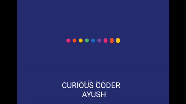
👇👇OUTPUT👇👇